Complexity is not always simplified sometimes it is read as a whole
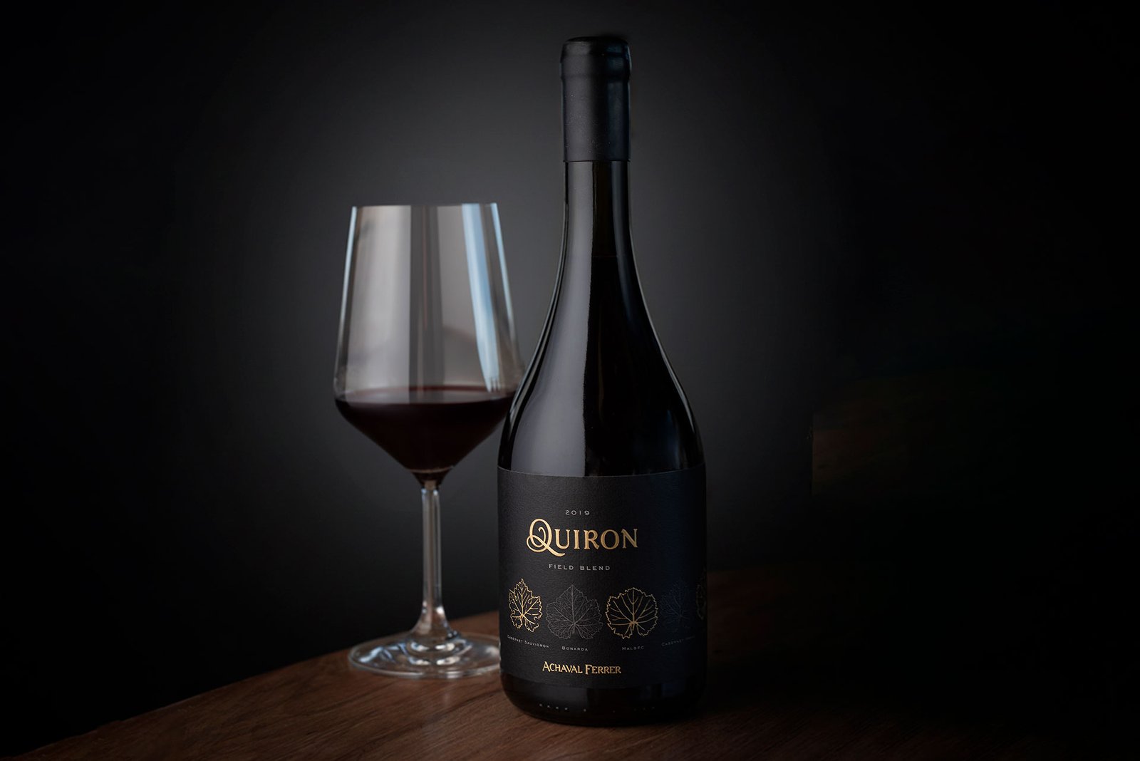
Within the Quimera pyramid —Achaval Ferrer’s house of blends— Quirón holds a singular place. It is the icon wine of the system and the piece that distills its deepest philosophy.
Quimera was born as a constant pursuit of perfection. An unreachable idea, yet always chased. Along that path, each wine plays a precise role.
Quirón represents the highest point of that pyramid: the wisdom to understand that complexity is not always simplified, sometimes it is read as a whole.
A blend that begins in the vineyard
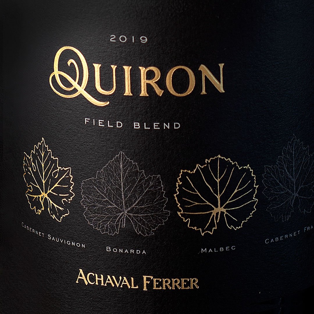
Quirón honors the experience of those immigrants who, in a small space, combined different grape varieties that still today share a single block. This field blend begins in the vineyard: the different grapes are harvested and vinified together, giving rise to a wine of unmatched singularity.
From strategy, we understood that this trait had to be the heart of the story. From design, the challenge was to render it with restraint, without artifice, in line with the language of the Quimera system.
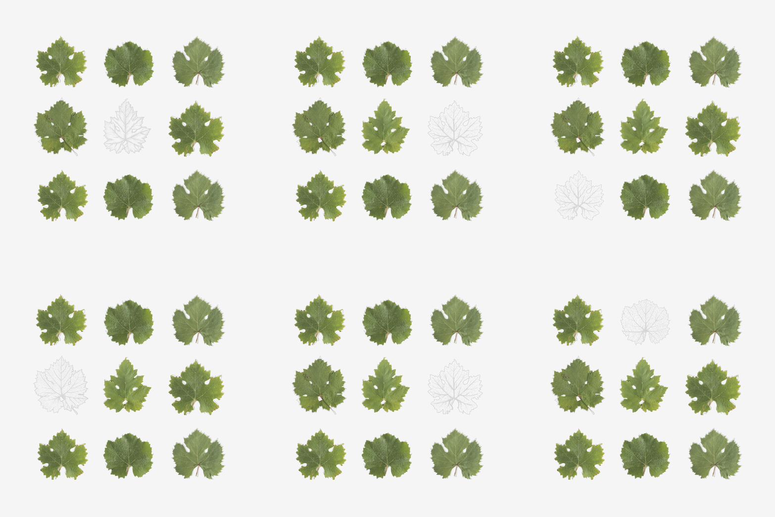
That process is expressed visually through an ampelographic study, laid out in a clean and minimal way.
Guiding idea
Finding order within disorder.
Identity
The idea made form
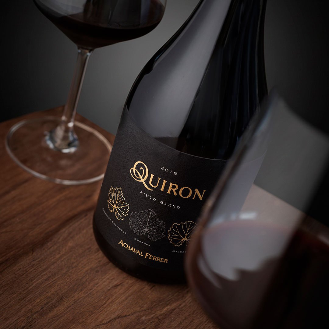
As across the whole Quimera pyramid, the pursuit of perfection is a constant. In Quirón it is expressed by finding order within disorder: analyzing and heightening the virtues of each varietal so that each contributes its uniqueness and, together, they elevate the blend.
The leaves are arranged on a single canvas that unifies label and back label, reinforcing the idea of wholeness, continuity and balance.
The logotype is built from the spiraling Q, the unifying seal of this portfolio.
An icon within a system
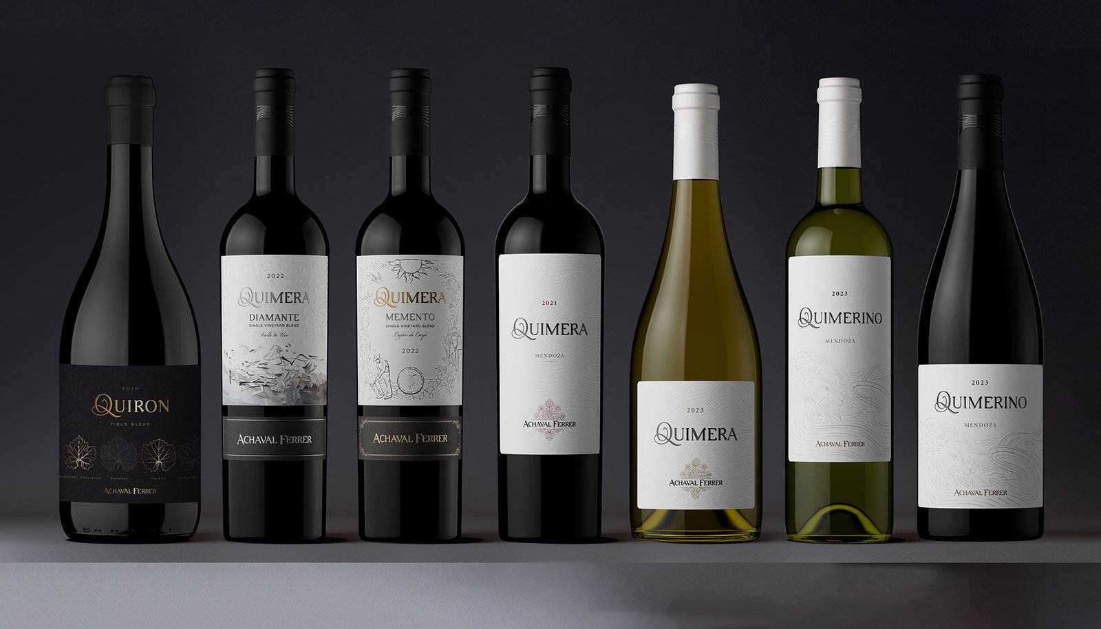
The development of Quirón’s packaging started from a clear premise: its value does not come from isolating it, but from understanding it within the system. It converses with Quimera, Quimerino, Memento and Diamante, setting itself apart through depth and meaning, not through an excess of resources.
The impact of the project lay in consolidating a clear and coherent pyramid of blends, ordering the portfolio and projecting Quimera as a living system, able to grow without losing its identity.
When the strategy is solid, design organizes, sets hierarchy and builds meaning.
We design systems that grow without losing their essence