The first chain of children’s hair salons in Argentina.
Services
Brand redesign, packaging and website.
The fun, playful spirit of Tijeritas
We redesigned the image of Tijeritas, the first chain of children’s hair salons in Argentina.
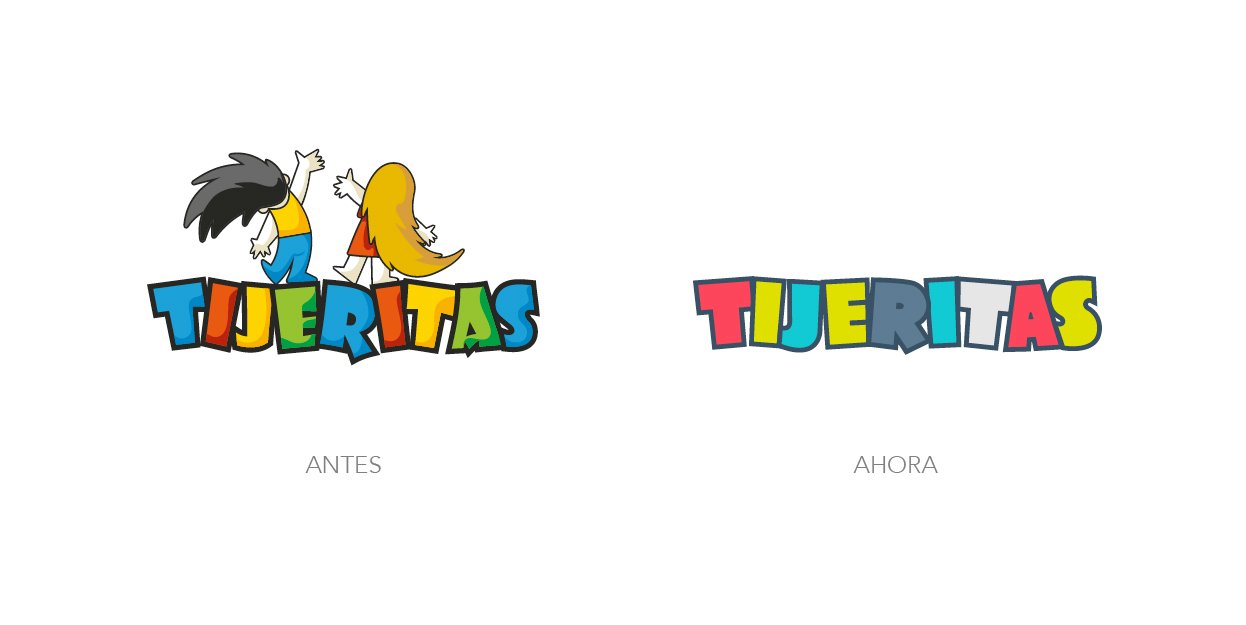
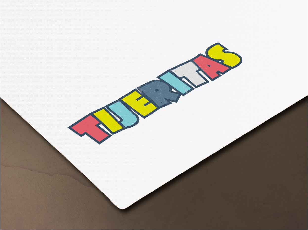
In the new brand, the typographic base was kept, but the drawing of several letters was improved and the edges were rounded to achieve more warmth, the color palette was changed, and the characters were removed to improve how it works in application, above all at small sizes.
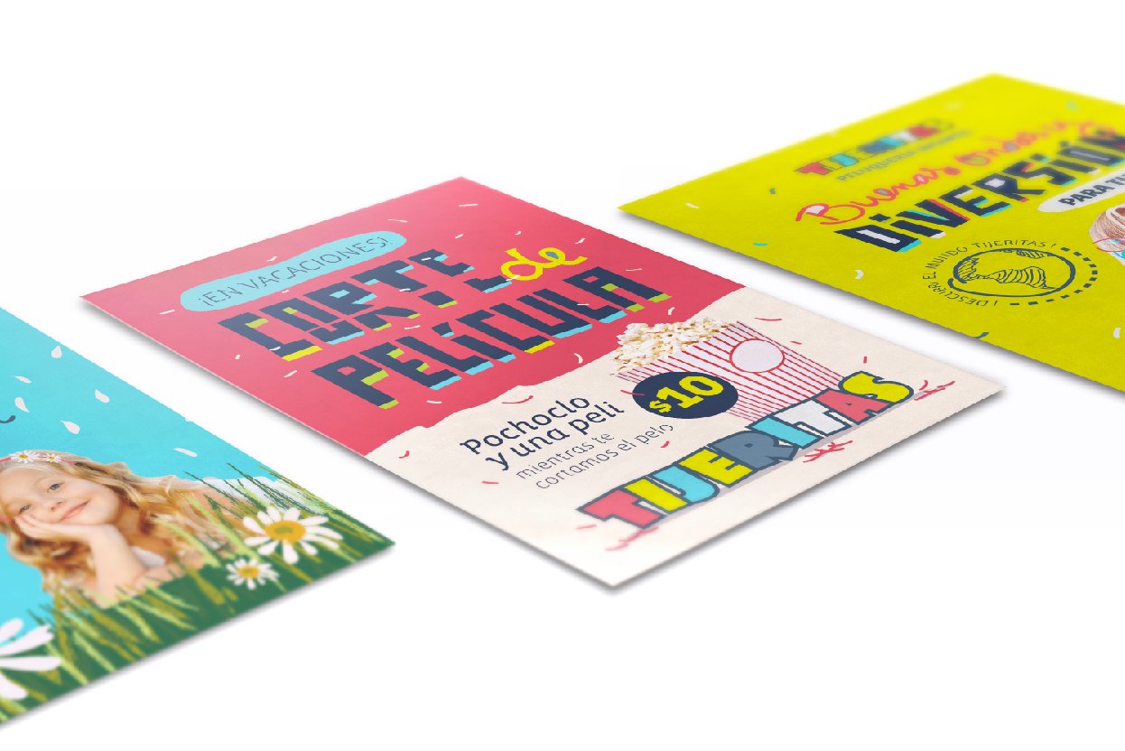
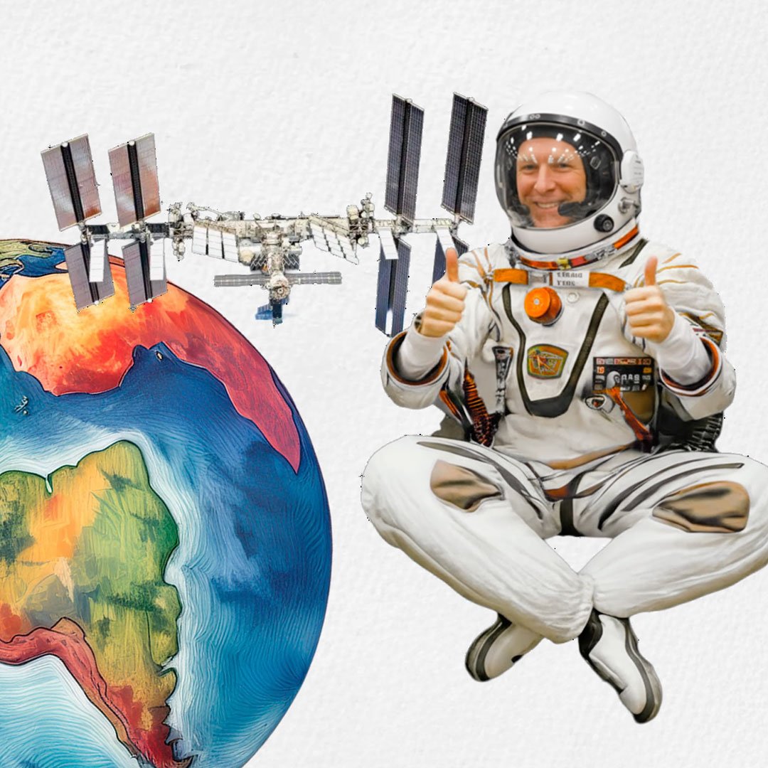
We worked on an aesthetic that would bring freshness and a new appeal to the brand, through altered photographs and a striking, bright and lively color palette.
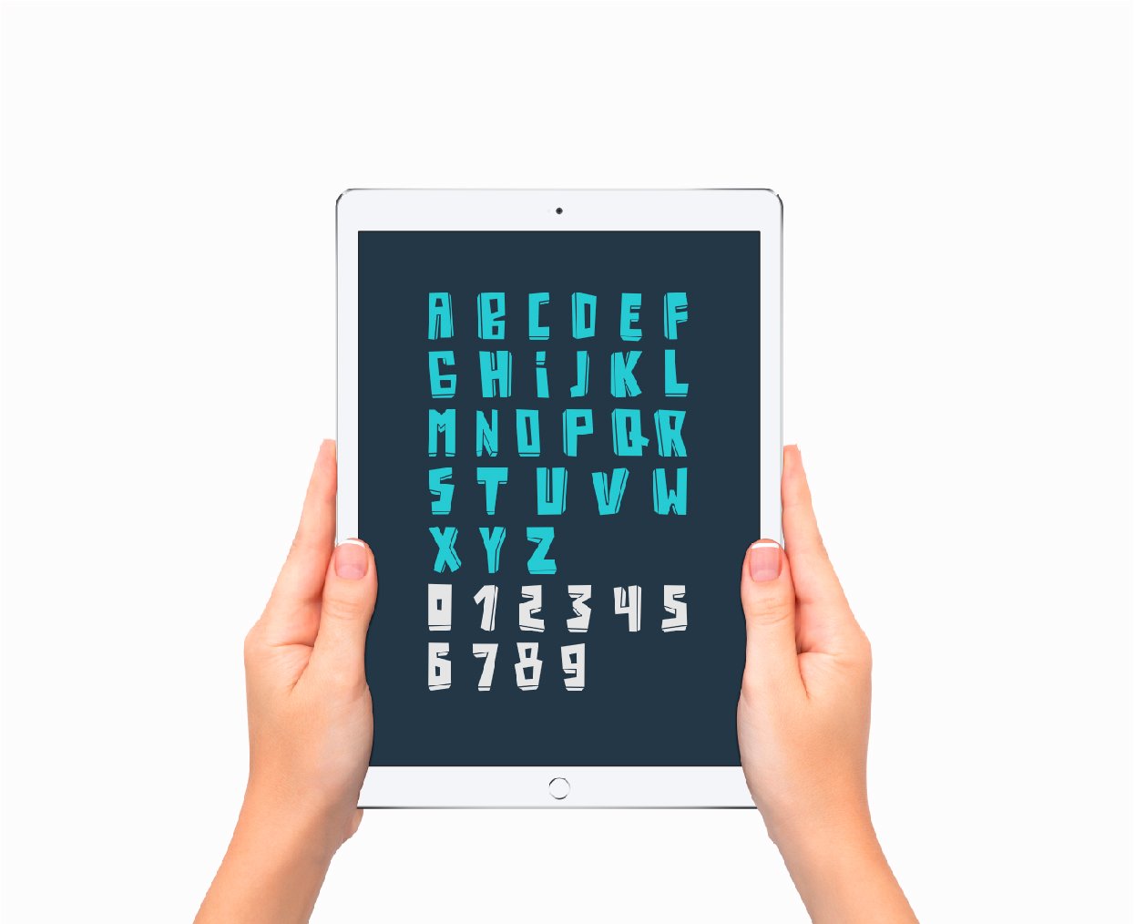
A legible sans serif typeface was used, combined with gestural lettering, to give the compositions dynamism. At the same time, a custom typeface was created for the brand identity, seeking to convey the fun, playful spirit of Tijeritas.
The packaging for the products (shampoo, conditioner and gel) sold in the stores was also produced, creating different characters with the collage technique, and using the color palette chosen for the brand.
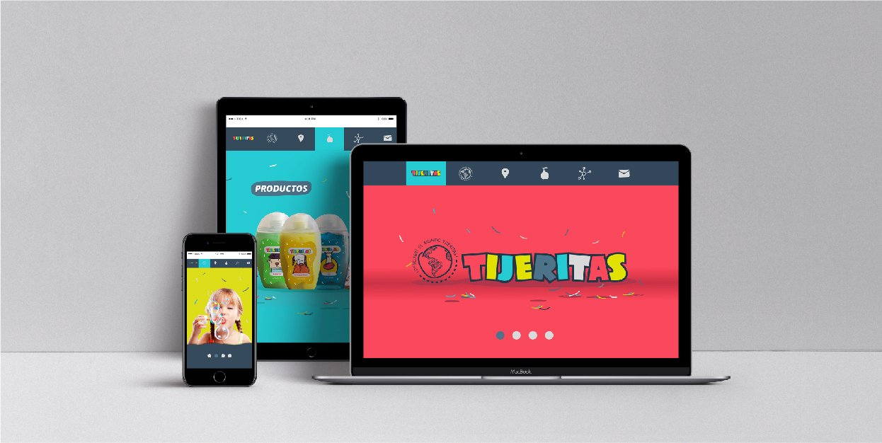
The branding work is completed by redesigning and coding the new website in responsive design format.