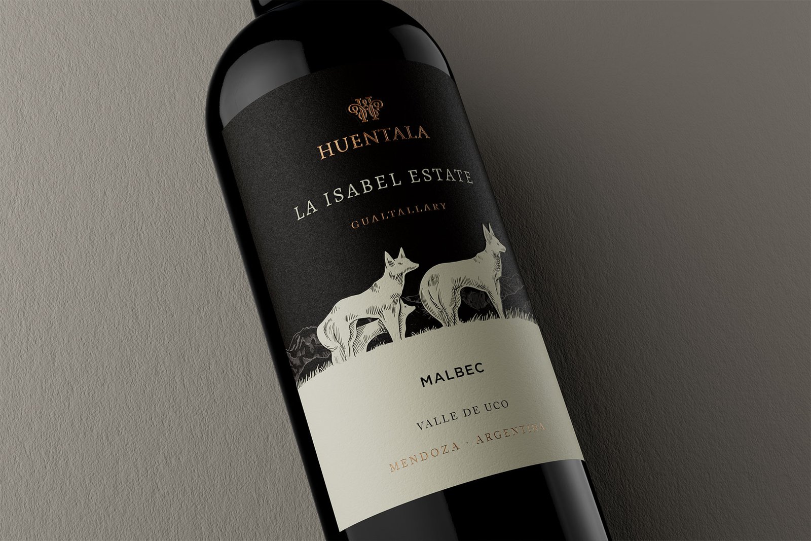
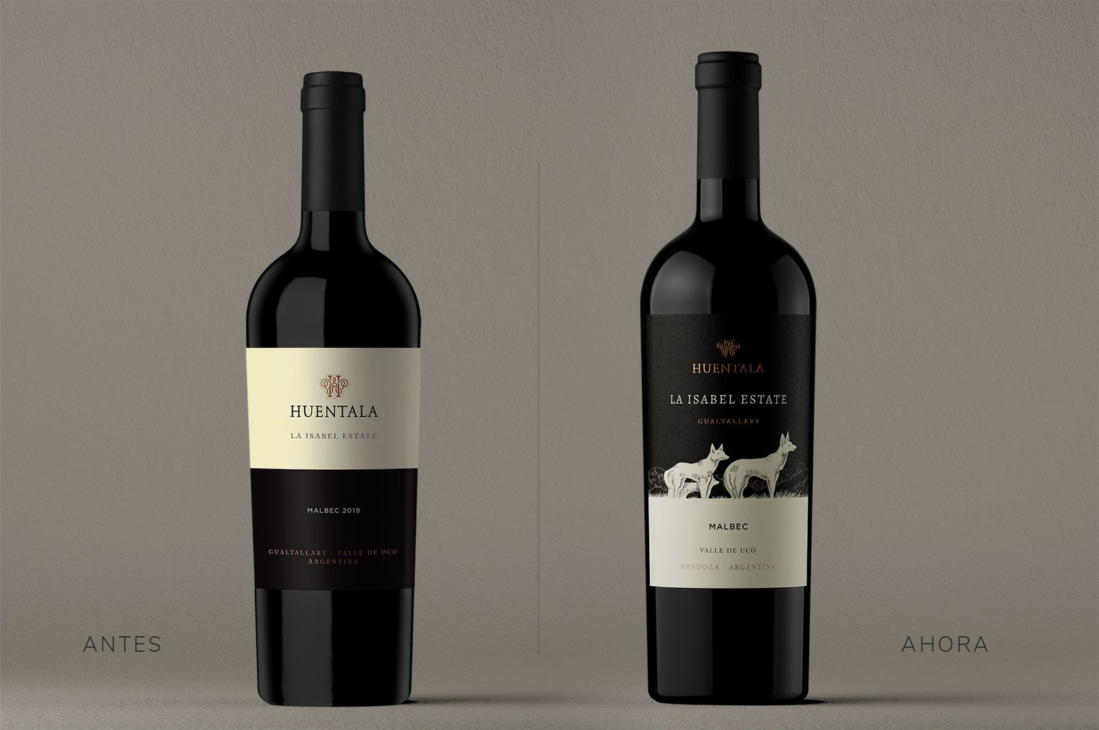
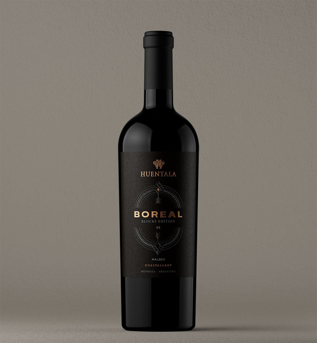
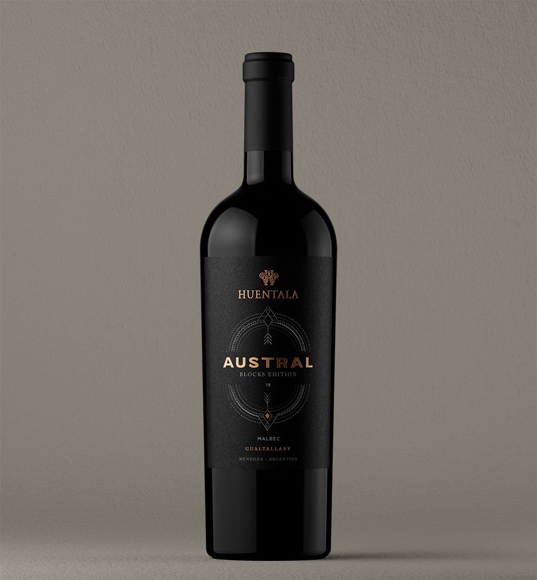
brand strategy, portfolio architecture, naming, art direction, packaging design, back labels, film production, point of sale.
A winery that had spent twenty years naming its wines after the varietal learned to name them after the soil they come from.
The challenge
Full rebranding and packaging system for a line of four single-parcel wines. The brief started as a label redesign and ended up as a review of how the winery understands and tells its own terroir.
Canto Rodado has been producing since 2006 across three estates in the Valle de Uco, barely eleven kilometers apart. For almost two decades it communicated the same thing as everyone else: the varietal, the vintage, the altitude. The result was a portfolio that was correct and perfectly interchangeable with any neighbor’s.
The problem wasn’t aesthetic. It was narrative. The winery had a real distinction and wasn’t telling it: its three estates sit on four different soils, and that difference comes through in the glass far more than the difference between two Malbecs from the same parcel.
On top of that came a concrete constraint. The line was going out to an export market where the consumer doesn’t know the Valle de Uco and has no reason to. Any system that required an explanation up front was doomed.
So the brief had two fronts pulling in opposite directions: to tell something more complex than before, and to make it legible to someone looking at a shelf for four seconds.
The idea
Soil first. Varietal second.
We inverted the hierarchy of the label. Where it used to say Malbec at 40 point, it now says the name of the soil. The varietal drops down to a service line, alongside the vintage and the alcohol percentage.
The winery’s own name already held the answer and no one had used it: a canto rodado is a stone the water carried and polished over centuries. It is, literally, the soil of the Valle de Uco. The brand had spent twenty years naming its own terroir without realizing it.
GUIDING IDEA
The brand already knew the answer. We just had to stop interrupting it.
The four soils
Each wine in the line takes the name and the graphic character of the soil it comes from. The winemaking team defined the four; art direction gave them form.
01
Alluvial
Rounded stone, fast drainage, deep roots. It is the winery’s founding soil and the one that gives the most tense wine. The label uses the canto rodado texture at actual scale, unfiltered.
02
Calcareous
White, porous, with carbonate at the surface. It brings the acidity that characterizes the line. It was resolved with an off-white and a blind emboss, no ink.
03
Clay
Compact, holds water, ripens late. It is the fleshiest wine of the four. It was worked with an earthy red and a matte stamping.
04
Sandy
Loose, warm, low yielding. It gives the most floral wine and the hardest one to come by. It carries the most open typeface in the family and a paper with more grain.
What stays
What stays: the name, the 2006 crest, the proportions of the Burgundy bottle and the capsule color code, which the local market already recognizes. Touching any of those four things would have cost more than it contributed.
What changes
What changes: the entire typographic hierarchy, the naming system, the palette —which goes from four decorative colors to four colors derived from the actual soils—, the materials and the back label, which stopped being legal copy and became the place where the soil gets told.
The packaging system
The family is built on a single grid and four variables: color, texture, paper and finish. Everything else —the typeface, the position of the crest, the width of the service line— is identical across the four.
That discipline is what lets the four labels read as one family from a meter away and as four different wines from thirty centimeters. It is also what makes it possible to add a fifth soil the day the winery buys another estate, without redesigning anything.
The back label carries a map of the three estates with the wine’s soil marked. It is the only element that demands reading, and it sits where reading happens: in the hand, not on the shelf.
The launch
The line was introduced with a two-minute film shot in a single day, across the three estates, following the path of the water that formed the cantos rodados. No voice-over, no winemaker talking to camera, no glasses spinning against the light.
It was completed with a series of point-of-sale pieces designed for export: neck hangers, shelf strips and a four-bottle display that assembles the soil map when the bottles are placed in order.
The launch film — 2′
The impact
The line went out to the United States and the United Kingdom in March 2026. In the first four months, the winery reported that the best-selling wine of the four became the Calcareous, which under the previous scheme had the slowest turnover.
But the result that interests us most is another one. The sales team stopped selling varietals and started selling soils, and that changed the conversation with the importer: from a price discussion by varietal to a portfolio discussion.
A small winery doesn’t compete on volume. It competes by having something to tell that the one next door can’t copy. Soil can’t be copied.
Project details
Client
Bodega Canto Rodado
Brand
Línea Suelos
Project
Rebranding and packaging system — Línea Suelos
Year
2026
Markets
United States and United Kingdom
Services
brand strategy, portfolio architecture, naming, art direction, packaging design, back labels, film production, point of sale.