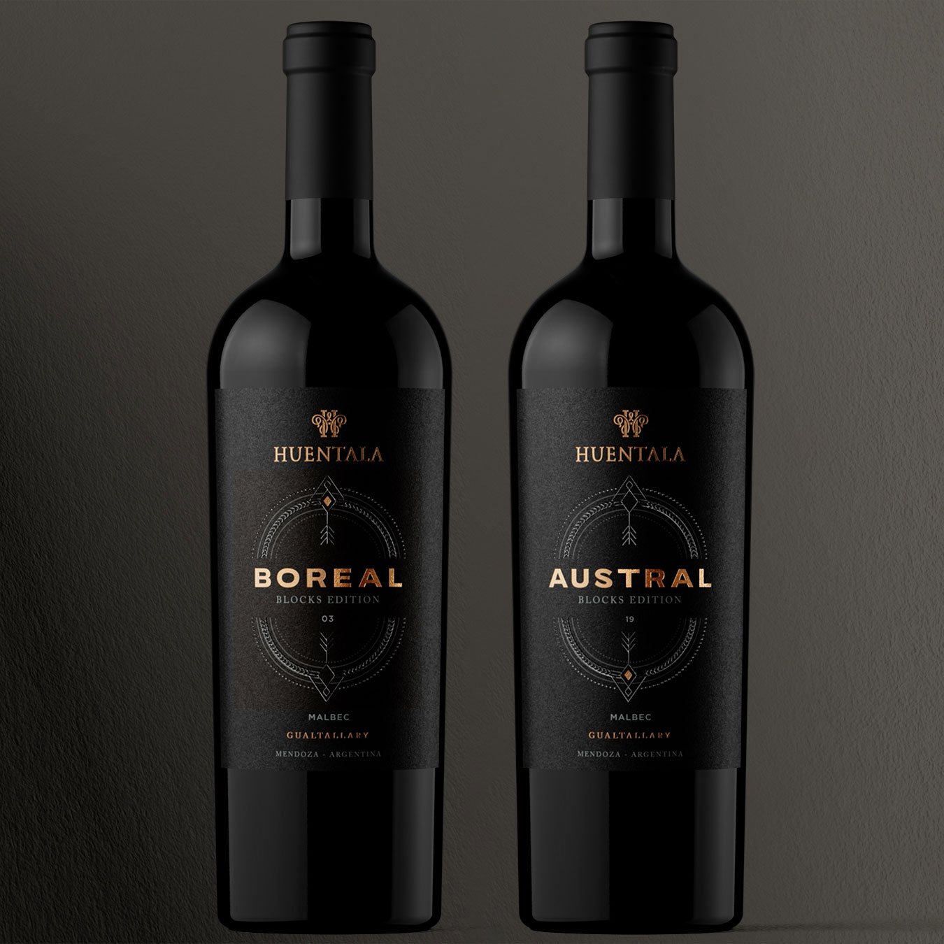
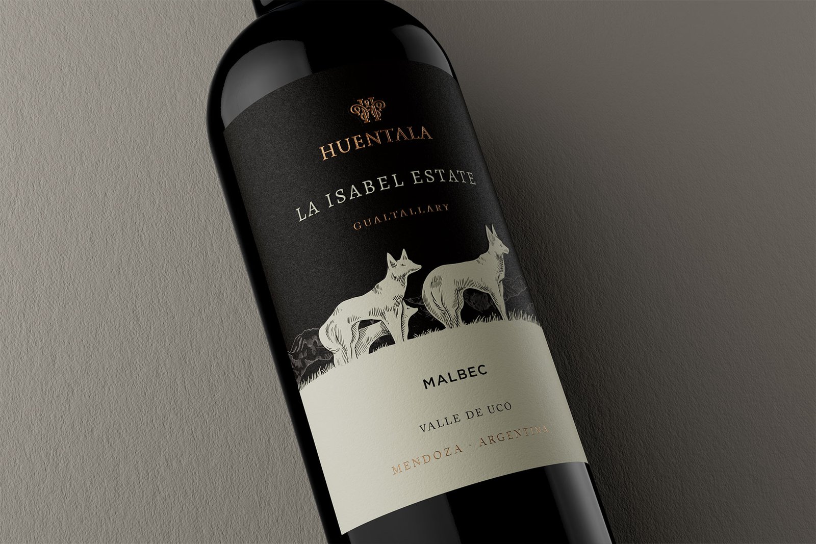
As part of the strategic consultancy for the brand restructuring of the Huentala Wines portfolio, at Argency we defined a brand architecture designed to narrate the territory in depth. An architecture that advances with a conceptual zoom in: from the Gualtallary region, to the La Isabel Estate vineyard, and then to the detail.
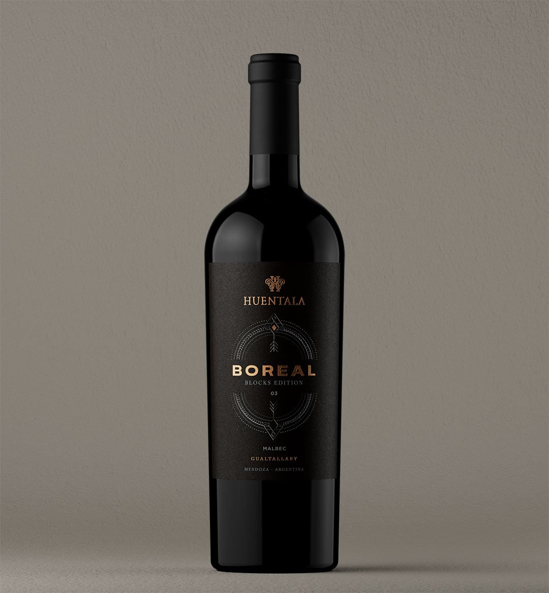
Within that new narrative logic, the Block Editions line evolved and was renamed Boreal and Austral, two wines made with grapes from blocks located north and south of the dry riverbed that crosses the vineyard. The new naming not only places them geographically, it brings precision, character and a story of their own.
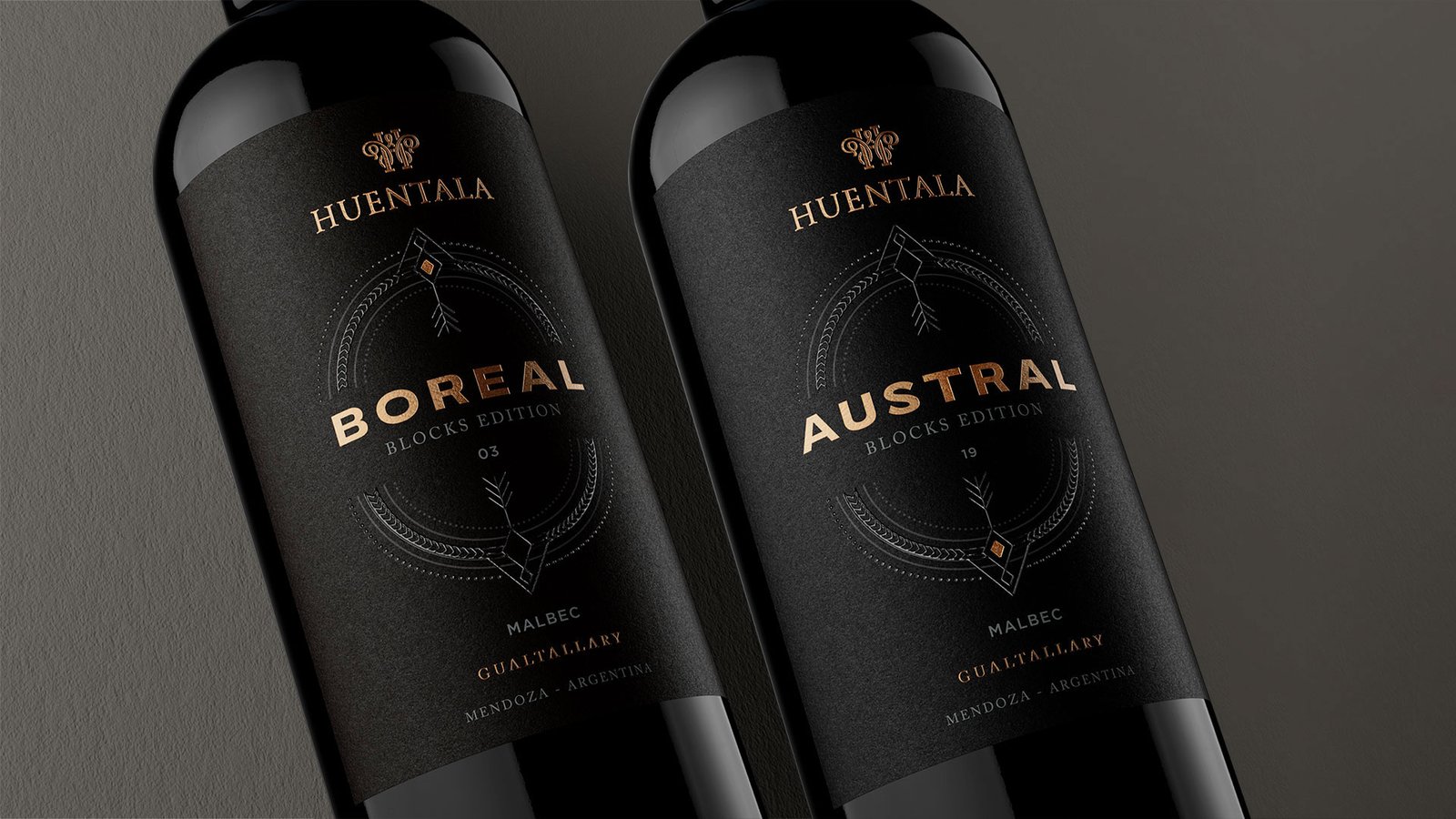
On the design side, the challenge was to keep recognizable elements of the previous system while introducing a more symbolic and sophisticated identity. That is why we kept the black background —present in the original line— as an element of continuity, and incorporated a compass rose as the new visual axis. Applied with raised varnish, this subtle figure marks the cardinal points and brings sensory depth, elegance and narrative orientation.
And yes, between Boreal and Austral there is a small detail that changes. But you have to look closely.
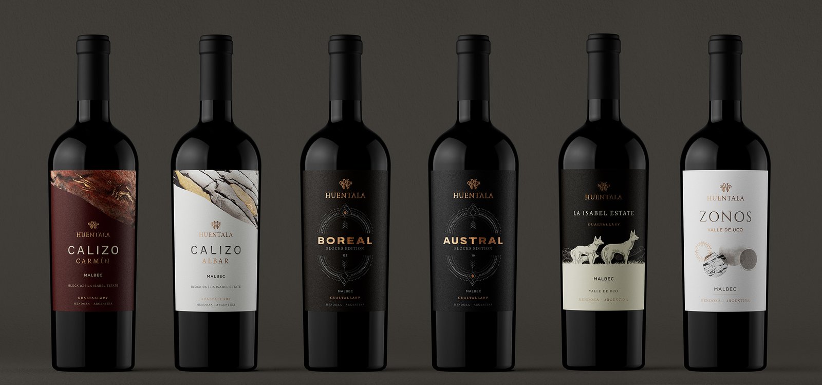
This redesign is part of a larger body of work: a brand universe in which each name and each label expresses a different chapter in the story of Huentala Wines’ premium wines:
Huentala Calizo, La Isabel Estate, Zonos. Along with the refresh of the entry-level lines Sombrero, Gran Sombrero and the redesign of Zorro Salvaje. Because when strategy and design work together, every detail —even the smallest— makes sense.