Brand and packaging design for Norbu. Coffee roasters.
The name Norbu comes from "Norbulingka", the summer palace used by the successive Dalai Lamas since 1780 , which means "jewel of the park"
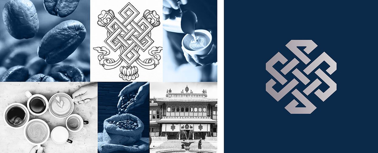
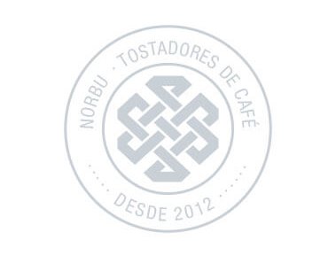
The letter "O" was replaced by a reinterpretation of the endless knot, one of the 8 symbols of Buddhism that represents infinite wisdom, in such a way that it also recalls a jewel. Which, in the end, is what coffee beans are.
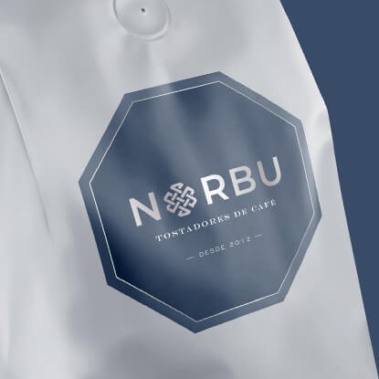
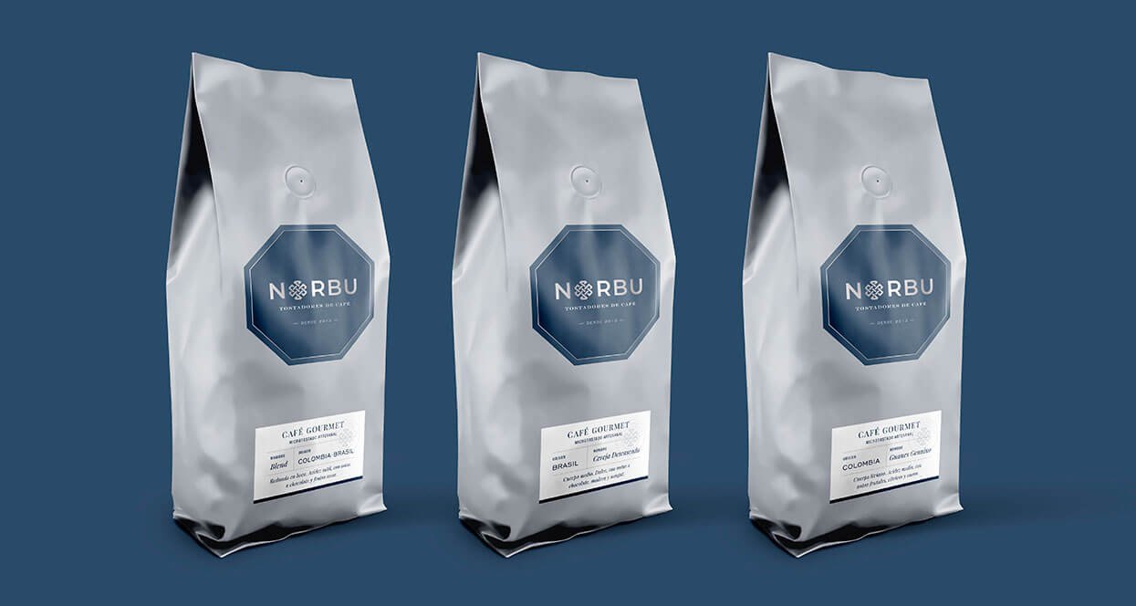
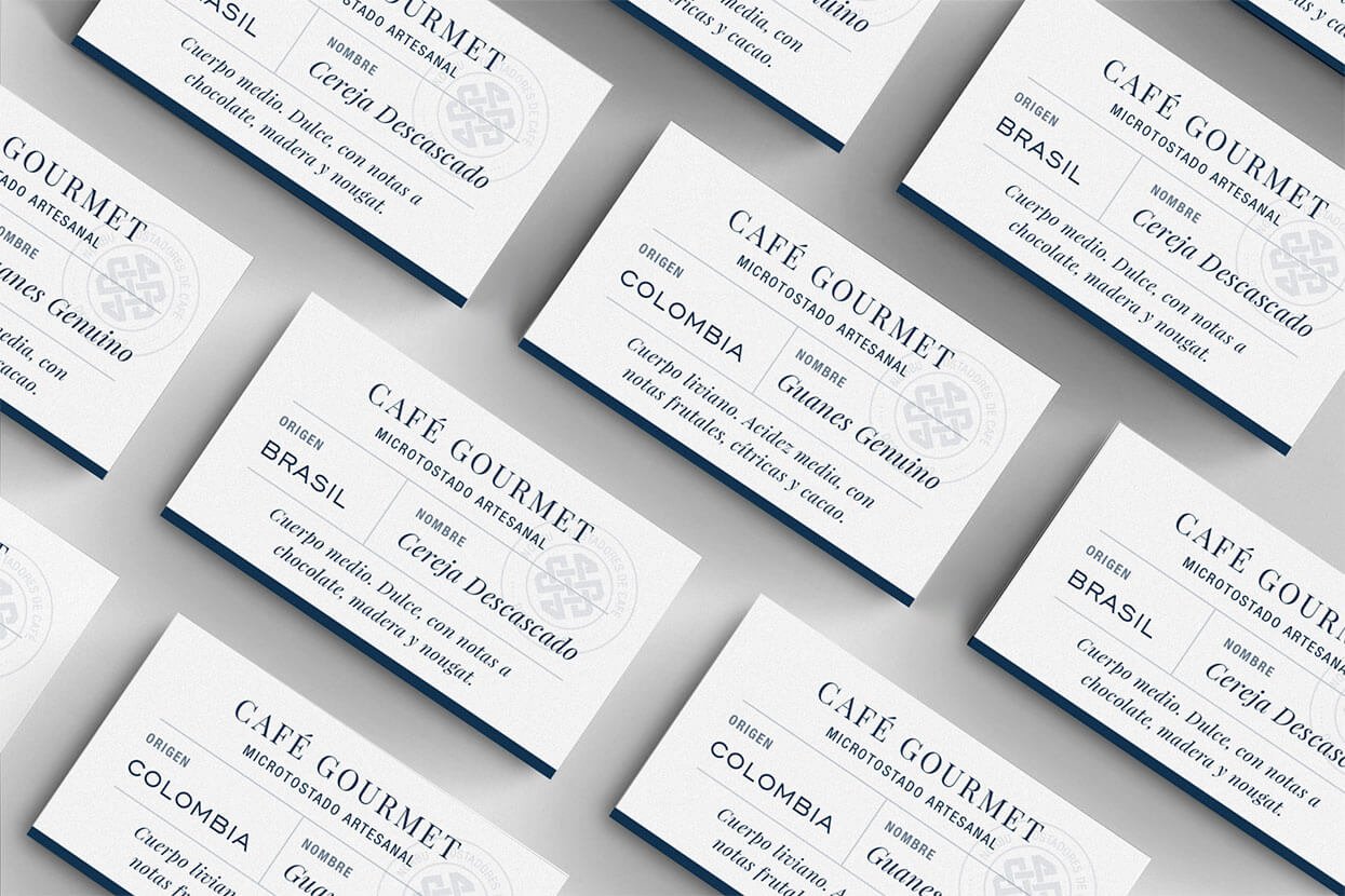
The packaging was based on the hexagonal shape of the Norbu symbol. Navy blue and silver dominate the main label. the secondary labels contain the coffee information, which varies according to origin.
The manifesto we wrote for the brand:
"Roasting coffee, like making sand mandalas, is an activity that transcends the activity itself. The patience and the knowledge needed for coffee beans to express their fullest potential resemble the virtues needed to make art or to create. It connects us with a state of reflection that makes us one with the universe. That is why we love roasting coffee, because it is a way of knowing ourselves and expressing ourselves, and of bringing out the jewels of nature through their fruits. We thus find endless enjoyment in doing what we do, an enjoyment that we believe carries over to whoever then delights in the aromas and flavors of our coffees. It is a virtuous, endless circle that fills us with balanced energy. That is NORBU."