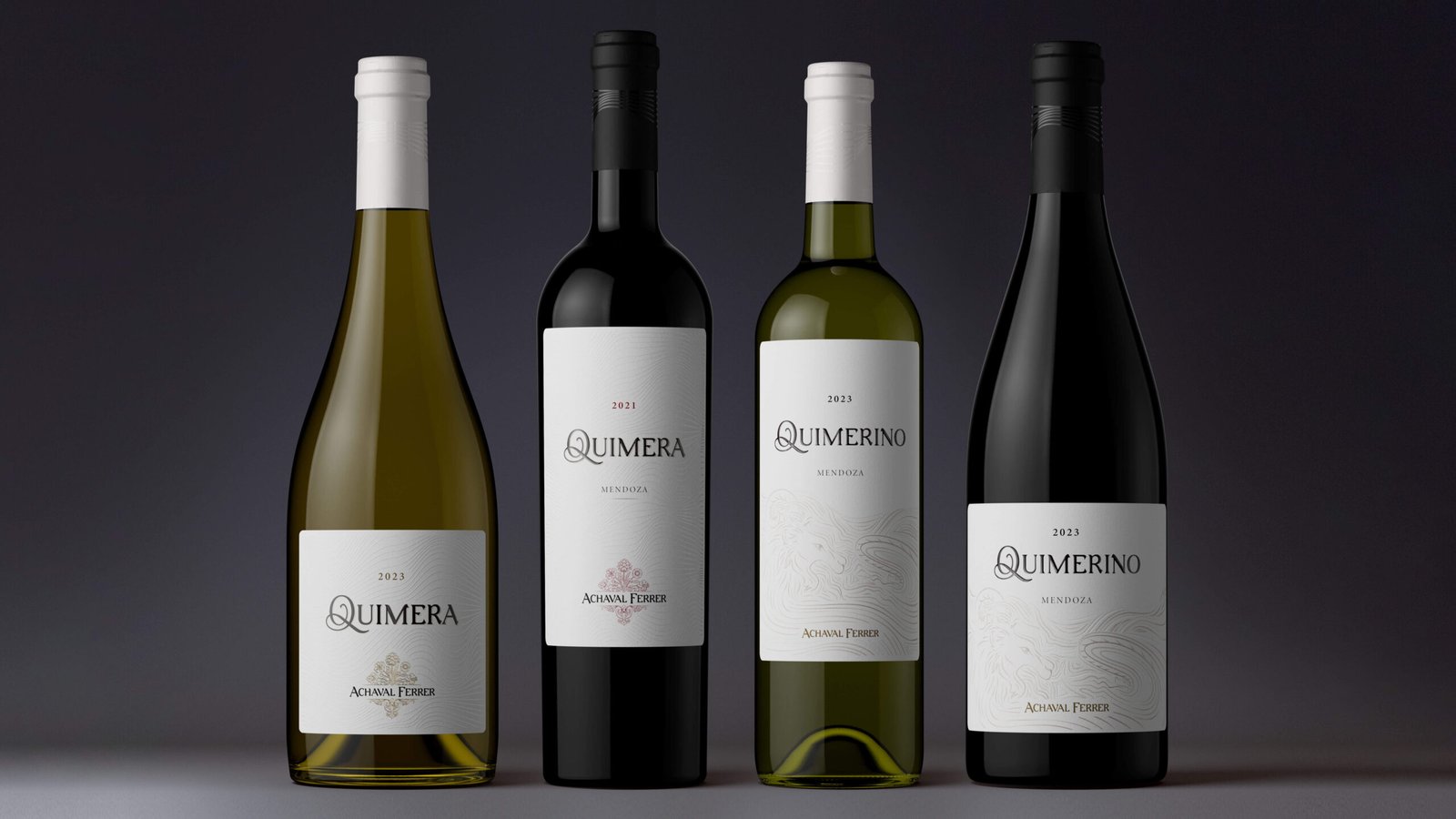
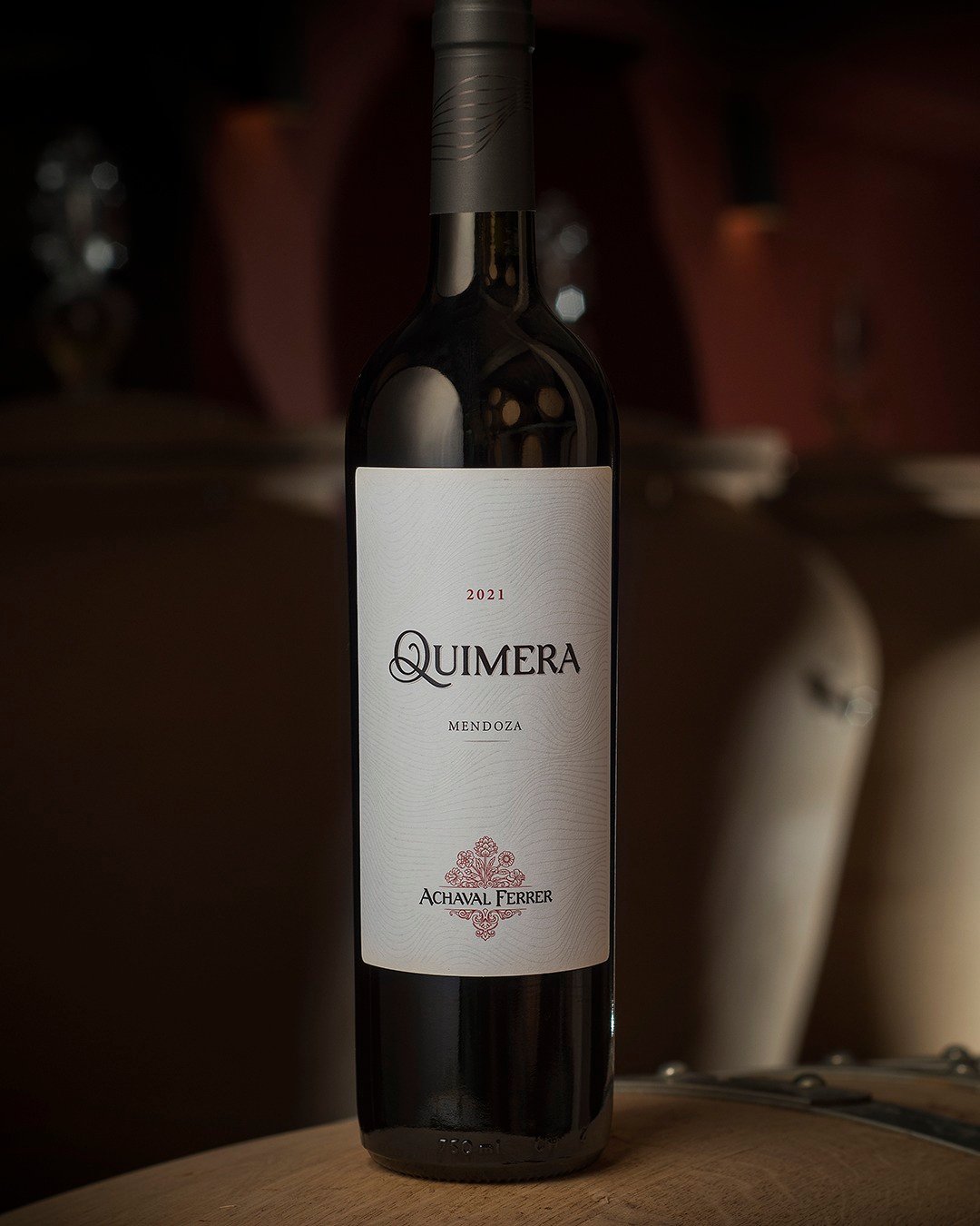
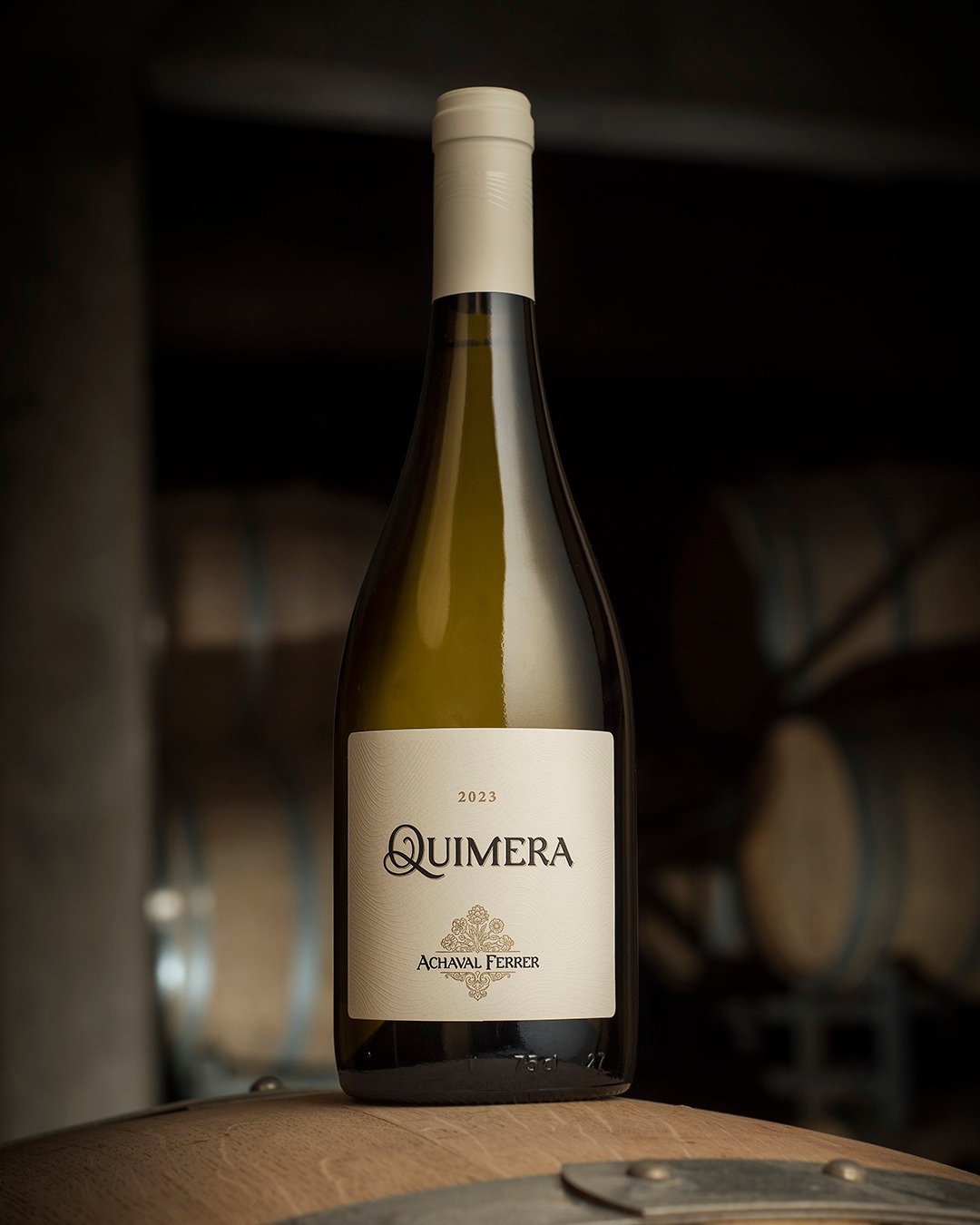
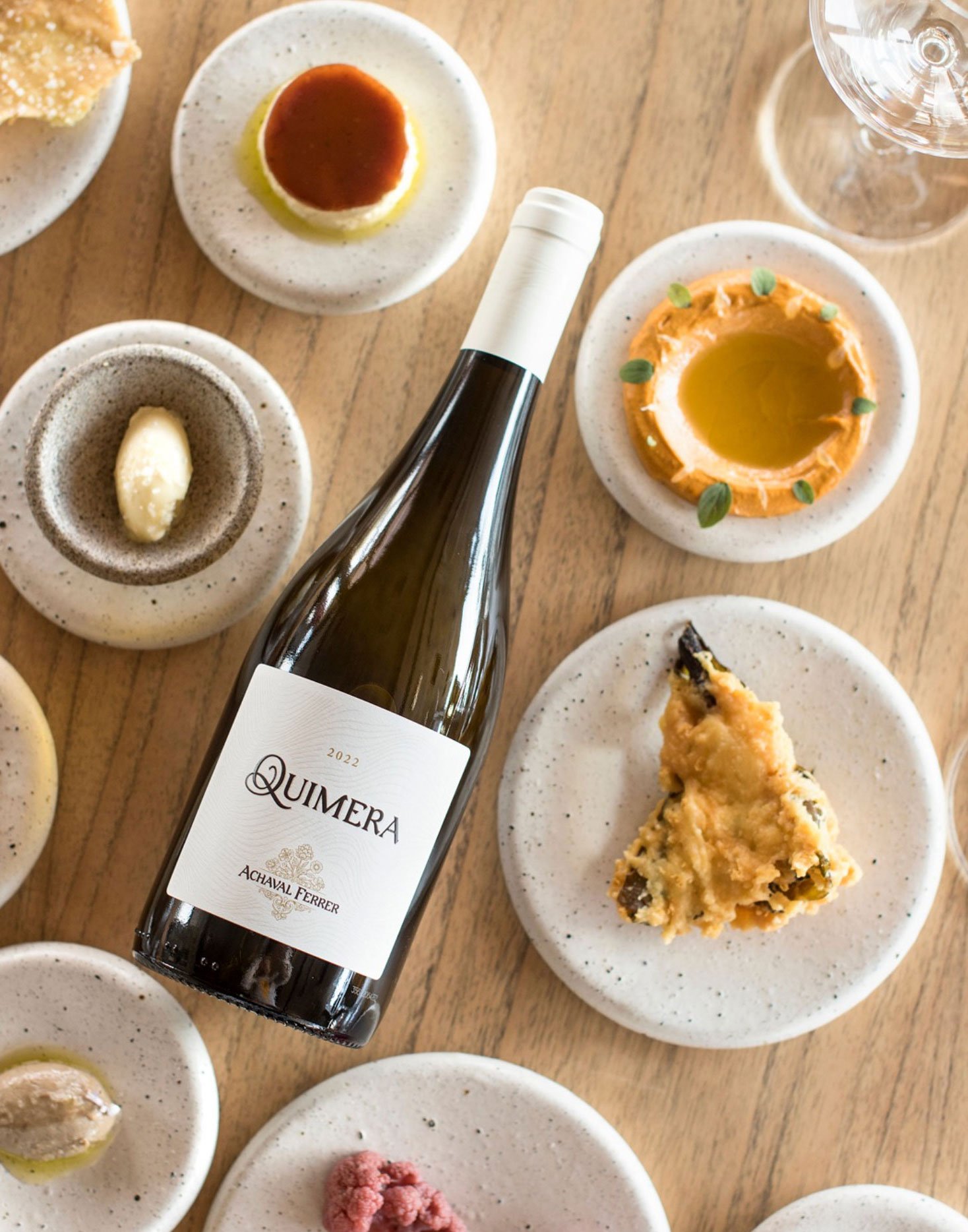
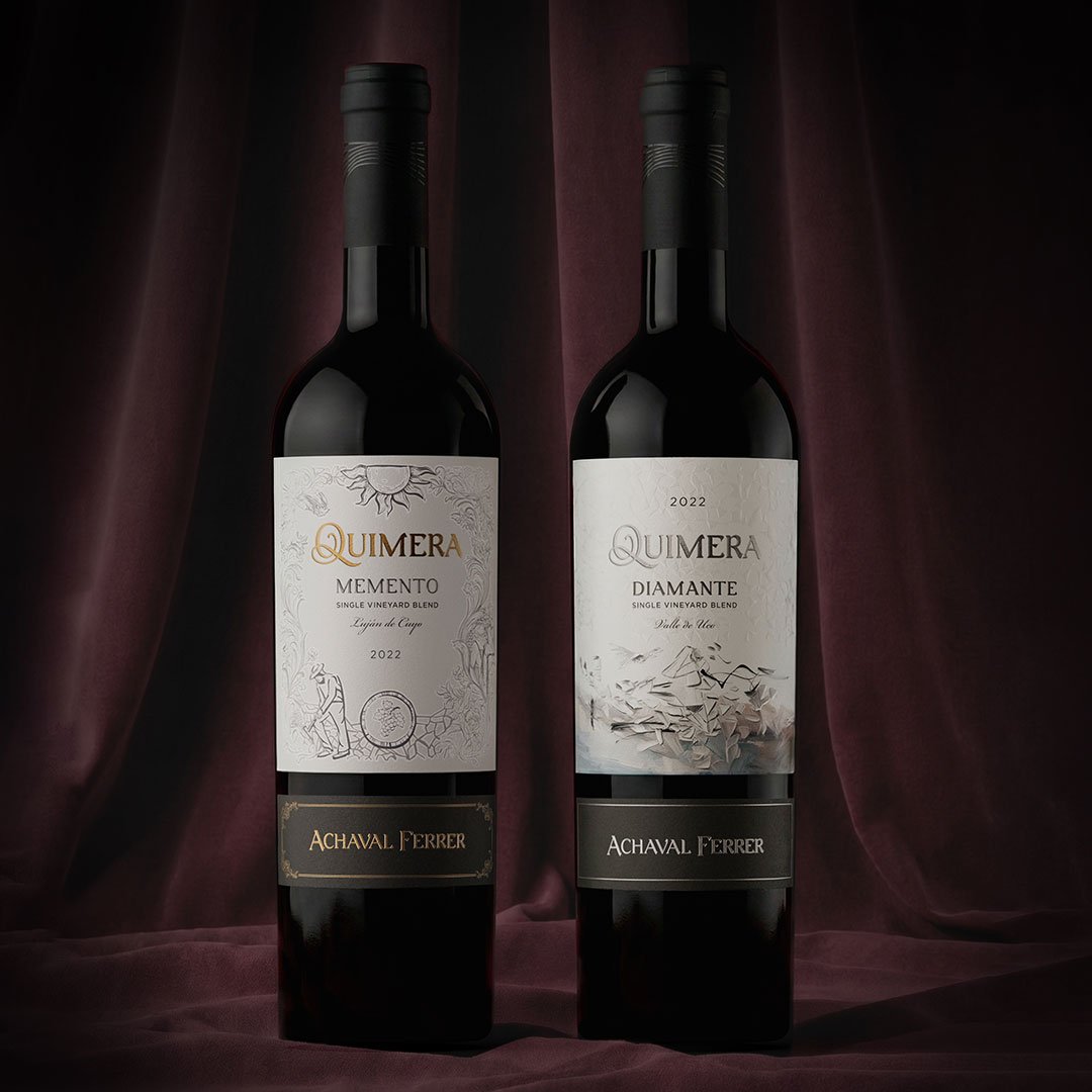
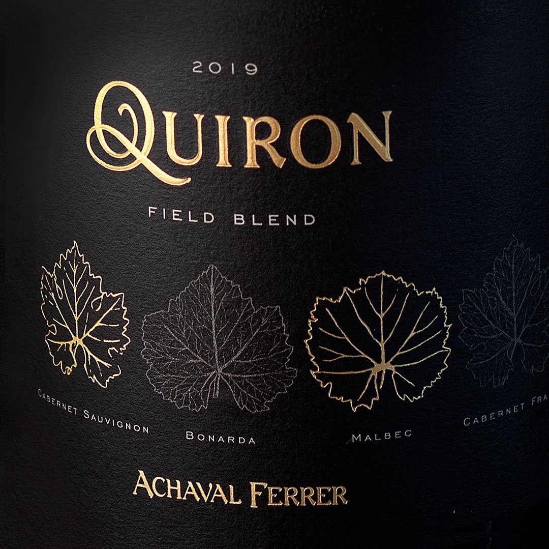
Full branding: brand, packaging for the pyramid of blends and the bistro identity.
The search for the ideal wine
Quimera, the house of blends of Achaval Ferrer
Quimera (From Lat. chimaera, and this from Gr. χίμαιρα, fabulous animal)
Imaginary creature with the head of a lion, the belly of a goat and the tail of a dragon.
That which is presented to the imagination as possible or true, without being so.
The Search for Perfection
For Achaval Ferrer, Quimera stands for "The search for the ideal wine. Its dream, even knowing it to be impossible".
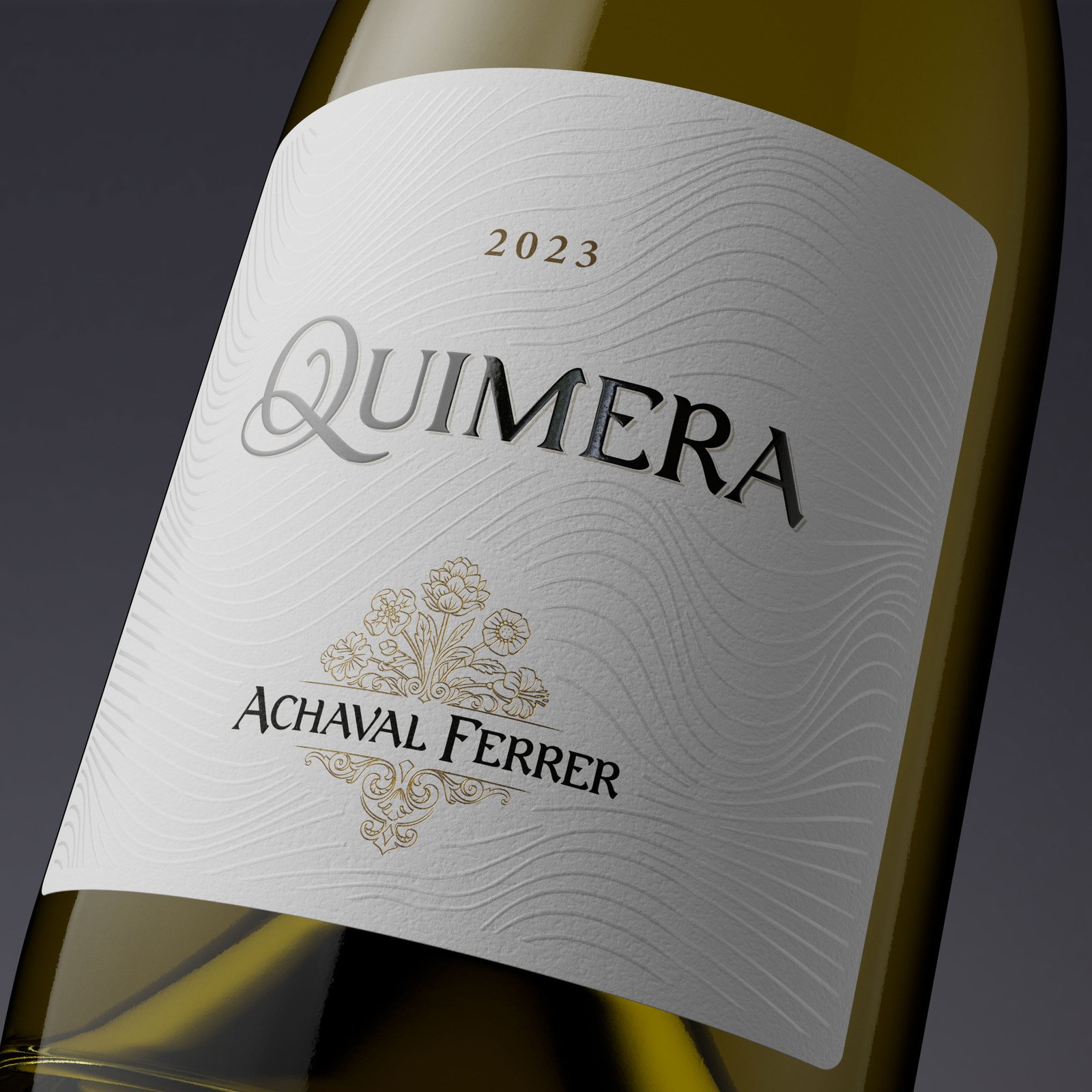
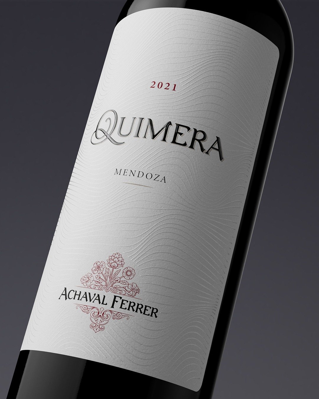
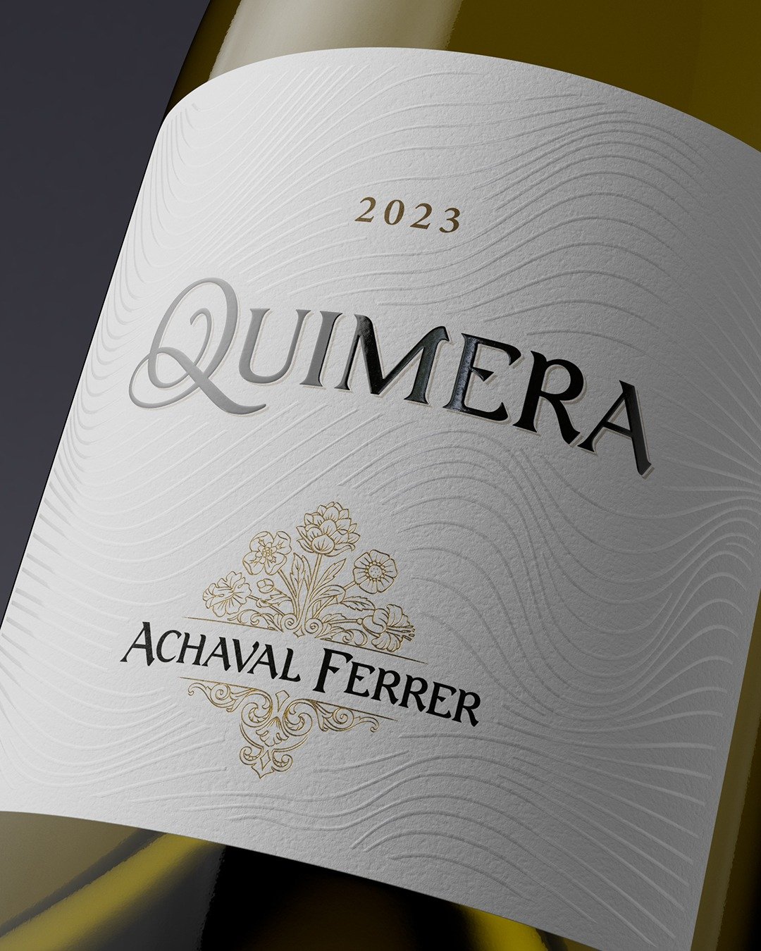
The search for perfection is a continuous process, even when the goal is unreachable. Sometimes the path looks clear and other times more mysterious. That is why, for the redesign of the Quimera packaging, at Argency we created a texture of very subtle lines. Sometimes they are visible at a glance, while other times you have to turn the bottle or touch the label to be able to "see" them.
Fulfilling a wish is never a straight line; the paths are labyrinthine.
That is why the initial "Q" of the brand takes the shape of a spiral and stands for the tireless search for perfection, the complexity and the elegance of memorable wines.
The Challenge
The challenge of creating this full branding included the design of the Quimera brand, the redesign of the red blend packaging, the design of the packaging for the first white wine of Achaval Ferrer, the rest of the pyramid of blends, among them Quimerino and NDP still in progress, as well as the identity of the winery bistro.
Quimerino: A New Symbol
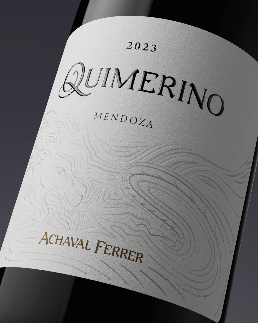
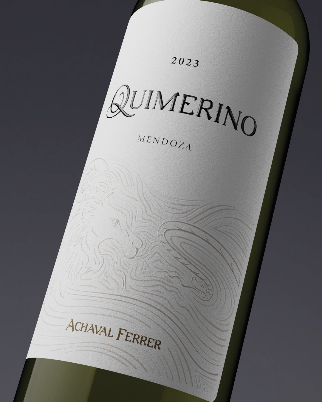
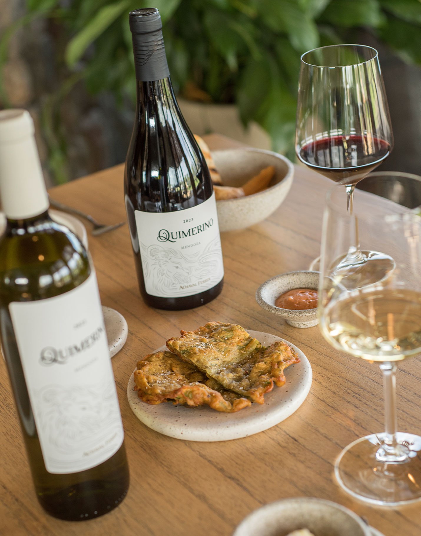
"Quimerino" is the name we created to christen the "secon vin" of Quimera, representing the mythological creature with the head of a lion, the belly of a goat and the tail of a dragon. We built a strong, elegant visual system for the wines of the house of blends of Achaval Ferrer, turning the wavy lines of Quimera into an illustration of Quimerino. The logotype also keeps the spiral-shaped "Q", which symbolizes the search for perfection, along with the same brand typeface.
Quimera Bistro
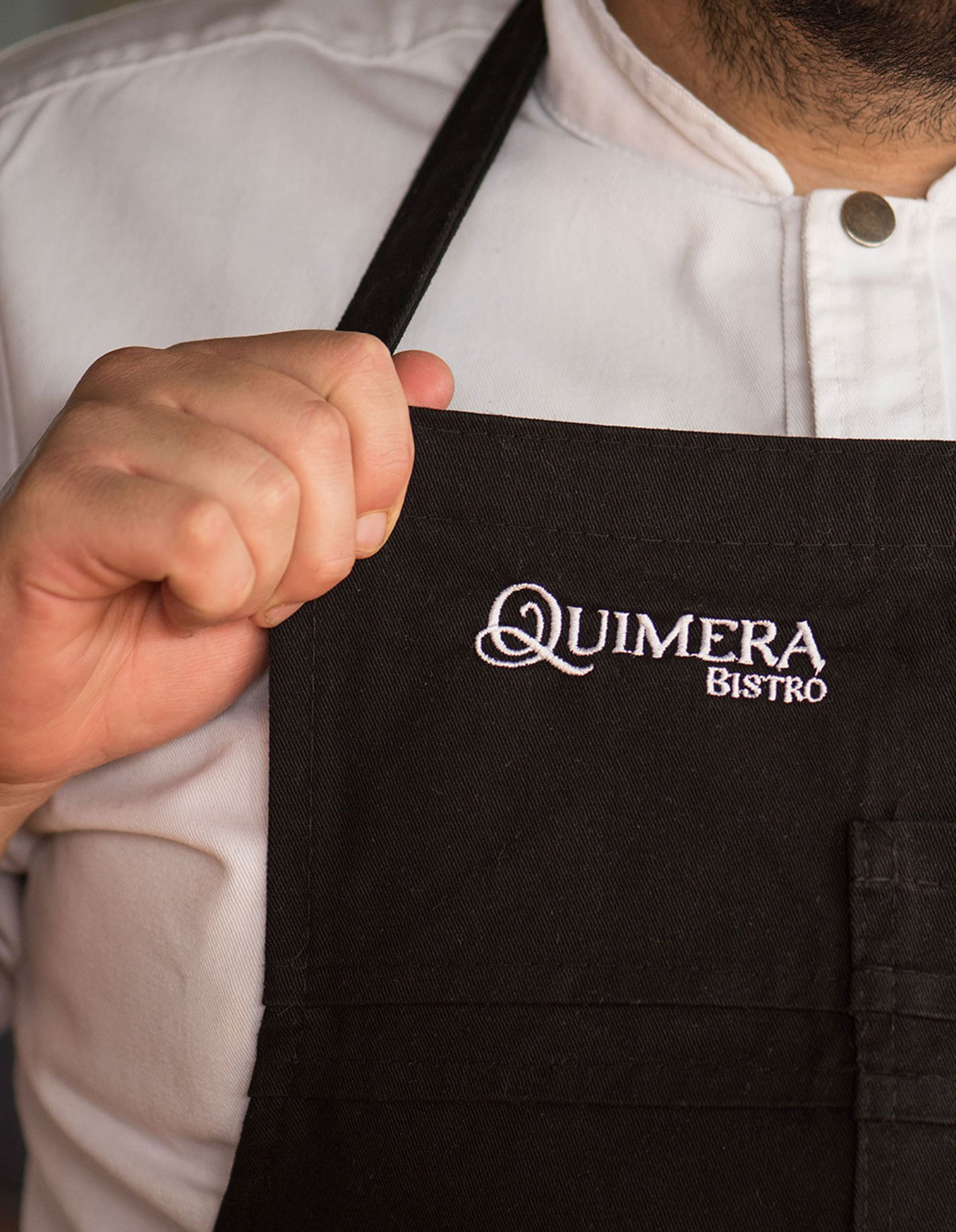
The branding we designed also applies to the winery bistro, which was “Recommended by the Michelin Guide 2024”. The dining experience is likewise a faithful reflection of the search for perfection through the disruptive and innovative fusion of regional cuisine and a subtle Asian influence.
In the following links you can see other projects we have developed for Quimera. Among them: videos, social media content and other packaging developments that complete the pyramid of blends of Achaval Ferrer.